The Color Management Workflow That Prevents Client Revisions
I used to think color was someone else's problem. I would cut the edit, drop a LUT on top, and ship it to the client with a vague promise that a color pass was coming. Then I got burned. I delivered a corporate piece to a client who opened it on their iMac, their phone, and their boardroom projector in the same afternoon, and I got three emails in four hours. Too warm. Washed out. Skin tones clearly wrong. Same video, three screens, three verdicts. That was the day I understood that color management is not a colorist's job. It is an editor's responsibility.
This is the workflow I built after that mess. It covers how I manage color inside Premiere Pro, how I prep projects for DaVinci Resolve when the budget allows a proper grade, and, most importantly, how I talk to clients about color so I never get those emails again. If you have read my take on Premiere Pro 26.2 and Color Mode, this is the practical side of that story.
Why Premiere's Default Color Setup Lies to You
Here is the uncomfortable truth: what you see in your Premiere Pro Program Monitor is not what your client sees. Lumetri operates in Rec. 709 by default for most HD timelines, but how that image gets displayed depends on your monitor, your OS, and whether you have enabled display color management. Most editors I know have never touched that setting. They are flying blind.
Go to Premiere Pro > Settings > General and scroll down to the checkbox labeled Display Color Management. If you are on a wide-gamut monitor, especially an Apple Display P3 screen, and this is unchecked, Premiere sends Rec. 709 values to a display that interprets them as P3. Your footage looks more saturated and contrasty than it actually is. You grade it down. Then your client watches it on a proper Rec. 709 screen and it looks flat and lifeless. Turn the setting on. Premiere will respect your monitor profile and convert. It is not perfect, but it is much closer to reality.
Pro tip: invest in a reference monitor
If you are serious about color, buy a real reference monitor calibrated to Rec. 709. The money I saved in revision rounds paid for mine within six months. Until then, enable Display Color Management and get a hardware calibrator for the monitor you already own.
Setting Up Your Lumetri Color Workflow
I work through Lumetri in a specific order. It is not the only way, but it has kept me out of trouble:
- Basic Correction first. Exposure, contrast, highlights, shadows, whites, blacks.
- Creative LUT second, only after the image is properly balanced.
- Curves for fine-tuning, usually a subtle S-curve for punch.
- Color Wheels last, for stylistic shifts or fixing problem areas.
The biggest mistake I see is throwing a LUT on unbalanced footage. LUTs are designed for correctly exposed images. Apply a heavy teal and orange look to footage that is two stops underexposed and you get mud. Not cinematic mud. Just mud.
Reading Scopes Without Pretending You Are a Colorist
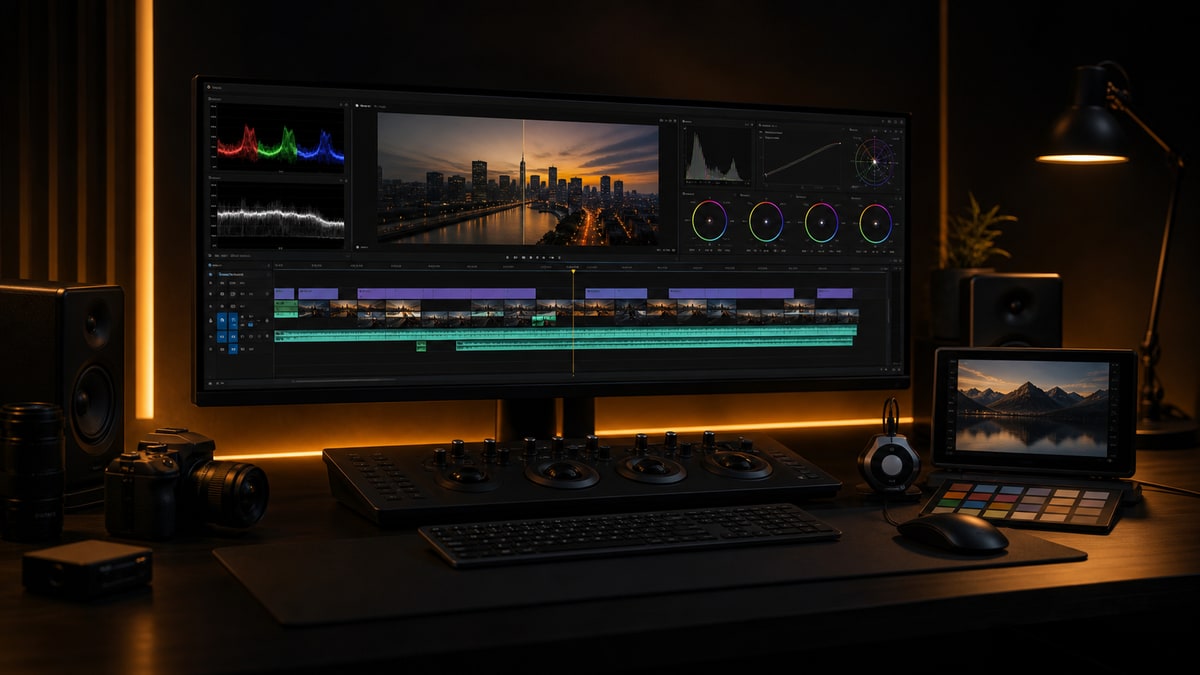
You do not need to be a full-time colorist to read scopes. You need three: Waveform (Luma), Vectorscope, and Histogram. Open them from Window > Lumetri Scopes. I dock mine above the timeline so I cannot ignore them.
- •Waveform (Luma) is your exposure map. Skin tones on most people sit around 50 to 70 IRE. Above 80 and the face is blown. Down at 30 and they look sick. I check the waveform on every clip before I do anything else.
- •Vectorscope shows where your colors live. Skin tone should sit on the skin tone line between red and yellow. If a face pulls toward green or magenta, it looks wrong even when you cannot say why.
- •Histogram tells you if you are crushing blacks or clipping highlights. I want the full range used without piling up against either wall.
Last month I cut a testimonial interview where the subject sat next to a window. On my monitor it looked a little bright but fine. The waveform told a different story: her face averaged 75 IRE with peaks at 85. I pulled her down with the Highlights and Whites sliders, added a circular mask to protect the background, and the shot went from amateur hour to expensive. The waveform showed me what my tired eyes had missed.
If you learn only one scope, learn the Waveform. Exposure fixes solve most color problems before you ever touch a creative LUT.
The Premiere to Resolve Handoff That Actually Works
For projects with a color budget, I round-trip through DaVinci Resolve. The round-trip has a reputation for being painful, but if you set it up right it is boring, and boring is exactly what you want.
The XML Export
Before you export anything, flatten your timeline. Nested sequences and speed ramps are where XML handoffs go to die. Duplicate your final sequence and name it clearly, something like PROJECTNAME_COLORLOCKED_DATE. Flatten everything inside the duplicate, and render any effects that will not translate in place as ProRes 422 before exporting. Then export from File > Export > Final Cut Pro XML. I keep a plain text COLOR_NOTES file in the project folder listing every speed change, reposition, or crop that Resolve needs to match. A clean project template makes this step almost automatic.
In Resolve
Import the XML on the Edit page, then immediately check the timeline against a ProRes 422 reference export of your locked cut. Confirm the cuts line up and the clip lengths are correct before you grade a single frame. Grade on the Color page in nodes, not layers, so everything stays non-destructive and easy to version. Render back to the same codec and frame rate as your source. I deliver ProRes 422 HQ back to Premiere for final output.
Back to Premiere
Import the graded ProRes file, lay it on a track above your original edit, and compare frame by frame at five to ten random points across the timeline. If it matches, you are done. If it does not, find out why before your client sees it.
Pro tip: keep the ungraded timeline
Clients change their minds. Keeping a 01_LOCKED_CUT sequence and a 02_COLOR_PASS sequence in every project means you can re-grade without rebuilding the edit from scratch.
LUT Management for People Who Hate LUT Management
I own too many LUTs. You probably do too. The trick is not having the best LUTs, it is knowing which ones work on which footage without scrolling through a folder for twenty minutes. My system is three folders only:
- •01_BASICS: technical conversion LUTs from LOG to Rec. 709 for each camera I shoot, such as Sony S-Log3, Canon C-Log2, Panasonic V-Log, and DJI D-Log.
- •02_CREATIVE: my actual look LUTs, no more than ten, split into warm, cool, dramatic, and clean. I deleted the other two hundred I never used.
- •03_CLIENT: custom LUTs a client provided or that I built for a specific brand. These stay with the project.
To load custom looks into Lumetri, open the Creative tab, click the Look dropdown, and choose Browse. Better yet, copy your LUTs into Premiere's LUT directory so they appear in the dropdown automatically. If you would rather start from a curated set that is already organized this way, my presets and plugins are built around exactly this folder logic. Just remember a LUT never fixes bad footage. It only makes it bad with a color cast.
How to Talk to Clients About Color So They Do Not Panic
This is the part nobody teaches you. Technical color skills matter, but client communication matters more. A technically perfect grade gets rejected if the client feels blindsided.
Set Expectations First
I never show a client a color-critical cut without context. Every work-in-progress review goes out with a note that says this is an edit review for pacing, structure, and content only, and that color and audio are not final until after picture lock. Those two sentences create a mental boundary. When the client knows the color is temporary, they stop fixating on it.
The Reference Frame Method
Once you are in the color phase, pick three representative frames and send them as stills before the client sees the moving grade. It gives them a concrete reference to react to without the pressure of approving a whole video, and it anchors the conversation. If they say the skin looks too orange, you can ask which of the three frames they mean. Feedback gets specific instead of subjective.
Translate Their Language
Clients do not know how to talk about color. They say it feels cold when they mean the shadows are too blue, or make it pop when they mean more contrast. Your job is not to teach color theory, it is to translate. When a client says something vague, I ask one question: can you point to a specific moment where it feels wrong? Timestamped feedback changes everything, because you know exactly which frame they are reacting to instead of guessing at their intent. A short consultation with a client up front often prevents an entire revision round later.
Export Settings for Color-Critical Delivery
Your grade is only as good as your export. I see editors spend hours on color and then export low-bitrate H.264. Every project gets a master export first: QuickTime, ProRes 422 HQ (or 4444 if graded in wide gamut), matched resolution and frame rate, with Render at Maximum Depth and Maximum Quality both checked. That master lives in the archive and is the source of truth for every deliverable. Need H.264 for web or ProRes for broadcast? Compress from the master. Never re-export from Premiere for different formats, because your grade shifts slightly every time you render.
For web I use H.264, VBR 2-pass, around 20 Mbps for 1080p and 40 Mbps for 4K, High profile. For broadcast I follow the spec sheet exactly, keep everything broadcast safe between 0 and 100 IRE, and embed captions as the network requires. Always request the delivery spec sheet. I have seen spots rejected for the wrong color space tag in the QuickTime header.
Pro tip: render quality flags matter
In Export Settings, under the Video tab, check Maximum Render Quality and Render at Maximum Bit Depth. They matter for color accuracy whenever your timeline has scaling, repositioning, or effects. They slow the export slightly, but the quality difference is real.
The No-Budget Color Grade
Most projects never get a DaVinci session. Here is my Premiere-only grade for those:
- Apply the camera conversion LUT in Basic Correction under Input LUT if shot in LOG.
- Set exposure with the Waveform. Skin tones at 55 to 65 IRE, highlights below 95, shadows above 5.
- Add a gentle S-curve in the Curves tab for film-like rolloff instead of harsh digital contrast.
- Pull Master Saturation to 80 or 90, then push selective colors back up with HSL Secondary if needed.
- Use the vignette sparingly, 10 to 15 intensity at most, only to draw the eye.
I graded a full twelve-minute corporate documentary in Premiere this way last quarter and a design agency with picky standards approved it on round one. That never happened when I was winging it. If your machine struggles under a heavy grade, my proxy workflow keeps playback smooth while you work.
When a Client Hates the Grade
It happens. Even with reference frames and clear communication, sometimes the client just does not like it. Do not defend it. Ask what specifically feels wrong and get a timestamp. Show two alternatives, not one: push one in the direction they want and take the other further than you think is wise, and they will usually land in the middle, which is where you wanted to be. Never say that is just how it looks, even when you are right. And once they sign off, export reference stills from three key moments so you have proof of the approved look six months later.
Color Is a Conversation, Not a Destination
This workflow is not about making footage look cinematic or filmic or any other buzzword. It is about control. Knowing what your image actually looks like, delivering something predictable to your client, and having a system for feedback that does not dissolve into subjective arguments. Good color management will not make you a colorist, but it will keep you out of revision hell, make your work look more expensive than the budget was, and give clients the confidence to hire you again. Start with the scopes, enable Display Color Management, organize your LUTs, and pick one reference frame before you grade.
Want more workflows like this? Browse the CTTP blog or grab my presets and plugins to speed up your grade.
Share this article